
 http://www.pvmgarage.com/2009/06/create-a-nice-web-portfolio-design-with-a-watercolored-background-in-photoshop/
 http://net.tutsplus.com/tutorials/site-builds/the-ultimate-guide-to-creating-a-design-and-converting-it-to-html-and-css/
 fan.com/tutorials/designing/making-the-clean-grunge-blog-design/


 analysis :
 analysis :
- weak grid system.
- weak typo hierarchy.
- navigation button quite okay.
- interface wise still okay and can be better
 analysis :
- well organised.
- basic and clear typo hierarchy.
- quite user friendly.
- nice grid system.
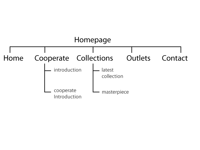
 analysis :
- Site looks clean and neat.
- Nice navigation system
- Contain other information make it more interesting to navigate

http://bigcartel.com/
analysis :
- nice color combination.
- simple graphics.
- good and pretty typo hierarchy.
- well organized and labeled.
http://mariecatribs.com/
analysis :
- nice color combination.
- beautiful graphic used.
- good and pretty typo hierarchy.
- well organized and labeled.