Me,Myself and I

Me,Myself and I

Wednesday, October 19, 2011

DSM 3 research.


Safavids ( Golden Age for Textiles)

The golden age of Persian art was the era of the Safavid dynasty. In this time of dynamic religious and political developments, painting and textiles achieved new heights of brilliance and opulence, and architecture flourished with the growth of cities.This resplendent volume provides a chronological history of the reign of each successive Safavid shah, including that of Shah 'Abbas I, who came to the throne in 1588. He not only built grand mosques and palaces, but also welcomed foreign travelers -- and their artistic influences -- to his court

(Textiles were greatly developed during the Safavids period. Isfahan, Kashan and Yezd produced silks, and they were also famous for its brocades.)


(Silks represents wealth, status of ruler, courtiers and aristocrats. Each of the brocades uses different style for horses uses Rescht, patterns to differentiate their communities.)


Carpets occupy the major position in the textile field, with key weaving centres in Kerman, Kashan, Shiraz, Yezd, and Isfahan. There were a great variety of types such as the hunting carpet, the animal carpet, the garden carpet and the flower-vase carpet.


(hunting carpet)


(garden carpet)

Wednesday, June 15, 2011

Wednesday, May 25, 2011

WIREFRAME


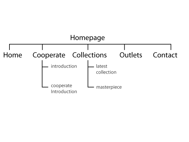
moodboard & sitemaps


MOODBOARD


ENCHANCED SITEMAPS
Project Definition
- Aim is to redesign commercial website
- Improve the interface design
Client’s Analysis
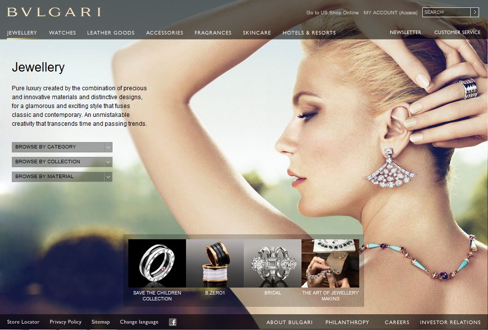
- A company that have over 30 years experience brings you beautiful gold jewellery, with excellent customer service, in a fine supreme shopping environment.
- Product range, quality gold & jewellery

Current Site’s Analysis Goals
- Lack of information that attract viewers for the homepage
- Need a better type treatment
- More interaction
Target Audience
- Ladies
Short & Long term Site Goals
- Increase the hits of the site
- Promotion and weekly showing latest collections in main page with different promotion to attract reader visit regularly
Competitor’s site analysis
- More informative but less text
- More design treatment on their site layout
- User-friendly navigation
- Clean and neat for their layout
- Typography treatment

Idea and Concept Implementation
- Better look for the site
- Promote company’s product at homepage instead of company profile
- Add in promotion and latest selling of the month.
- A more user-friendly navigation

Wednesday, May 18, 2011

TUTORIALS URL & HTML LIBRARY


http://net.tutsplus.com/tutorials/site-builds/from-psd-to-html-building-a-set-of-website-designs-step-by-step/


http://www.pvmgarage.com/2009/06/create-a-nice-web-portfolio-design-with-a-watercolored-background-in-photoshop/


http://net.tutsplus.com/tutorials/site-builds/the-ultimate-guide-to-creating-a-design-and-converting-it-to-html-and-css/


fan.com/tutorials/designing/making-the-clean-grunge-blog-design/


Some of the html script library I found.
1. Photo Slider http://www.jsmadeeasy.com/javascripts/Images/Photo%20Slider/index.htm
2. Picture Rollover http://www.jsmadeeasy.com/javascripts/Images/picture_rollover/picture_rollover.htm
3. Image Preview http://www.jsmadeeasy.com/javascripts/Images/image_preview/image_preview.htm
4. Switching Images http://www.jsmadeeasy.com/javascripts/Images/Switching%20Images/list.htm

ANALYSIS OF TOMEI WEBSITE


Analysis of the website :
- weak grid system.
- navigation button bar is at the bottom which the viewer might can't find them.
- plain color background made the website seems boring and unfinished.
- lack of consistency for every page.
- weak typo hierarchy.
- not well-organised.
- weak interface design.
- not user friendly, viewer have to refocus when proceed to another page.


Idea and Concept Implementation
- New look for the site
- Promote company’s product at homepage instead of company profile
- Add in promotion and best seller.
- A more user-friendly navigation


ANALYSIS OF COMPETITOR'S WEBSITES

analysis :
- good grid system.
- consistent.
- nice transition and flash.
- good typo hierarchy.
- nice interface design.


analysis :
- weak grid system.
- weak typo hierarchy.
- navigation button quite okay.
- interface wise still okay and can be better


analysis :
- well organised.
- basic and clear typo hierarchy.
- quite user friendly.
- nice grid system.


analysis :
- Site looks clean and neat.
- Nice navigation system
- Contain other information make it more interesting to navigate

ANALYSIS OF BEAUTIFUL WEBSITES


http://bigcartel.com/
analysis :
- nice color combination.
- simple graphics.
- good and pretty typo hierarchy.
- well organized and labeled.


http://mariecatribs.com/
analysis :
- nice color combination.
- beautiful graphic used.
- good and pretty typo hierarchy.
- well organized and labeled.


http://www.nikesnowboarding.com/
analysis :
- nice and clear typo hierarchy.
- simple and clear grid system.
- nice and interesting image used


http://en.tis-home.com/
analysis :
- simple yet neat grid system.
- interesting navigation button.
- simple yet harmony and attractive color combination.
- clear typo hierarchy.


MY BLOG CAN'T UPLOAD PHOTOS T.T

SITE MAP

Site Map

Tuesday, January 11, 2011

How to blend a healthy for bad breath juice
1. Who am i - health instructor
2. What is it - a healthy juice
3. What for - makes for those who had bad breath
4. 1st task - buy some vegetables and fruits (1-2 steps)
5. 2nd task - cut it all into parts (3-5 steps)
6. 3rd task - add some water and blend it all together (6-7steps)
7. OUTCOME - happy day without bad breath
8. SHOWCASE - Gallery

How to boil an egg
1. Who am i - housewife
2. What is it - an boil egg
3. What for - for a healthy breakfast
4. 1st task - buy some eggs (1-2 steps)
5. 2nd task - place raw eggs in saucepan and reduce the heat to low (3-5 steps)
6. 3rd task - slimmer for 2 to 3 minutes for soft-boiled eggs (6-7 steps)
7. OUTCOME - happy healthy and energized breakfast
8. SHOWCASE - Gallery

How to cook rice
1. Who am i - chef
2. What is it - cooked rice
3. What for - for dinner
4. 1st task - rinse the rice (1-2 steps)
5. 2nd task - combine long grain rice and water (3-5 steps)
6. 3rd task - boil the rice the low heat (6-7 steps)
7. OUTCOME - happy and tasty dinner
8. SHOWCASE - Gallery


(Website Sharing)


www.jbbakery.com


www.keithcakes.com.au


www.feastongood.com


www.comhalts.ie
(Tutorial Sharing)


Sunday, June 6, 2010

FLOW CHART

Questions:Why do you want to
use flowchart in your mobile interface design & screen interface design? How will it help your users to meet the interactive goals?

(On my opinion, i would prefer using flowchart in my mobile interface design & screen interface design so that the system in my phone is organize and all my folders or files is properly place in every section like photos should be in gallery,music file should be place in music folder and play with music player when chosen, the most important is the contact number is save in the phone book and make us more simple to search for it. The main reason of this flowchart to let us decide what to do with the program and how we gonna ended up when we need to decide something. The system also helps us by recommending which path we should so all of it will go smooth and also sometime tells us what to do or what will happen if we were to choose to option. It is very important because without the help of the system we will definitely won't know what to do with it.) (This flowchart thing it's main purpose is to help the user to understand more about the system and how to use to the system and also gives some additional help in deciding or some tips of using the system. The most important is the system must make sure the user doesn't get blur with the system and give up using the system as well because once the user felt tired or annoyed of using something they can't make it work properly the flowchart probably is a failure. It's system must be easy recognize by anyone and must a perfect tutorial or guidance for the user. Save the user from making hard decision and also shows the consequences after choosing the path. Make the user's mind clear enough to confront the problems.)

Sunday, May 30, 2010

Icon assignment


Gallery Icon Contact Icon Home Icon

Vector Icons


Pixel Icons
Home Icon
Contact Icon

Gallery Icon